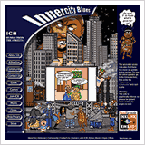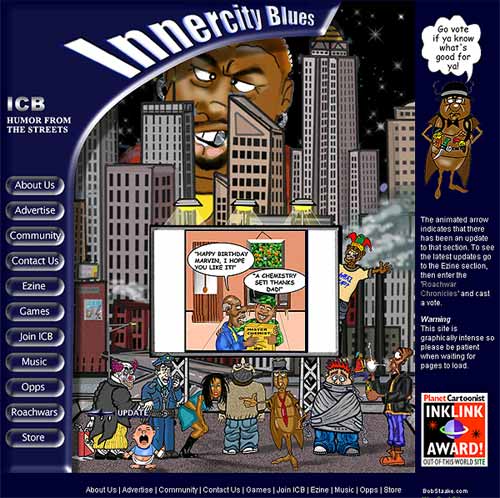
Innercity Blues is an urban humor site that is a mix of cartoon strips and parodies. The challenge with this site was to make it fun, lively and contemporary while keeping file sizes manageable for dialup visitors. The solution was a mix of static images, animations and javascript. Rather than a comic strip I decided that the site should resemble an animated television program. Using a table and sliced images for the layout on the index page I was able to insert an animated gif on the billboard in the composition. Also, like a television program, the main cast of cartoon characters is presented standing on an urban rooftop. Mouseover navigation buttons in a layer on the left-hand side of the page add to a sense of movement and interactivity with the site. An animated arrow, also in a layer, informs visitors of which section of the site has been updated with a direct link to the updated section.
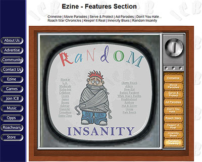
The best example of the television-like design is in the e-zine section. The interface is a television with the various section buttons serving as 'channels' for the television. The use of disjointed mouseovers means that, as you move your cursor over the channel buttons, the image on the television changes to reflect the section (click here to view the television interface). The use of optimized animations in Movie Parodies, Ad Parodies, Roachwars and Random Insanity sections again add to the feeling of viewing more than just a static page.
